
Designing a Desk, Not an App
The hard part wasn’t making Postmello look physical. It was deciding how the software should behave when the illusion was tested.
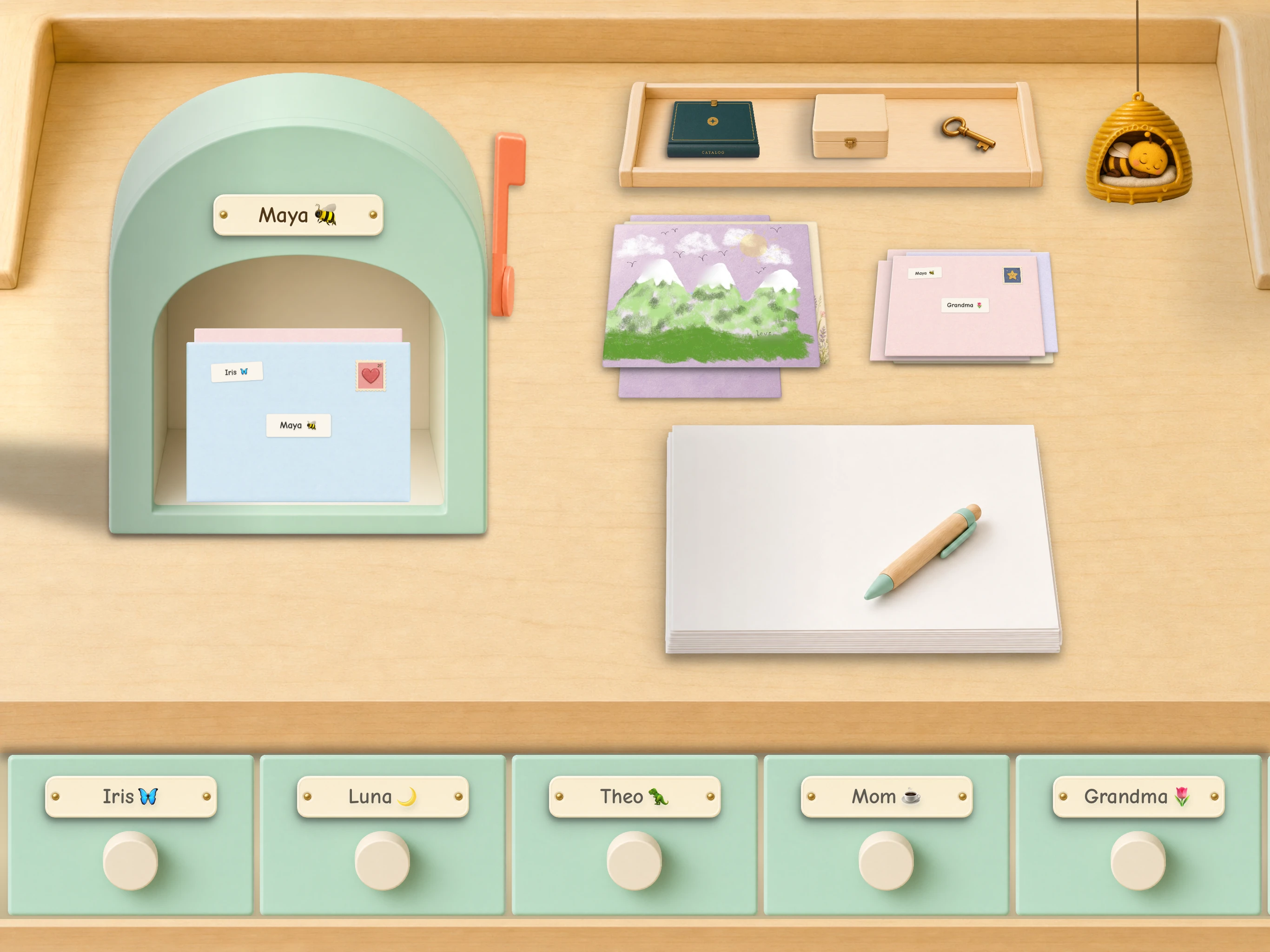
Postmello looks like a writing desk. There is paper, a mailbox, drawers, envelopes, stamps, a wastebasket and a little courier bee.
Those are the obvious parts.
The more interesting design questions appear when the metaphor runs into the things physical desks never have to deal with. What happens after a child mails a letter if the internet disappears? How do you make deletion safe without interrupting the desk with an “Are you sure?” dialog? How do you let someone write back on top of another person’s letter without quietly creating a forwarding mechanism? How do you offer beautiful things a child may want without turning that desire into pressure to buy?
If every difficult moment falls back to spinners, alerts, status screens and transaction prompts, then the result isn’t really a desk. It is a conventional app wearing a wooden costume.
So Postmello needed rules beneath the metaphor. The state of the desk should tell the truth. Losing something a child made should be the failure we fear most. A letter should remain an object rather than becoming another message in a stream. Privacy should come from the structure of the product wherever possible, rather than from warnings. And when the software needs to explain something, the world itself should do as much of that explaining as it can.
Those principles have shaped Postmello far more than the wood grain.
The design had to work for children, not for designers
Postmello took shape over more than 60 builds, with my children and their friends using it as it changed.
That process taught me how unreliable my own idea of “obvious” could be.
Sometimes I could see a problem coming. I would watch a child approach an interaction and know, somewhere in the back of my mind, that I was asking too much or that the next step was not going to be as clear as I wanted it to be.
Just as often, they surprised me.
Something I had taken completely for granted would stop them. An interaction that made perfect sense to an adult who had spent years learning the conventions of software meant nothing to them. And occasionally the reverse happened: something I was tempted to explain turned out not to need an explanation at all.
Watching them made it possible to distinguish between an interface that looked understandable to me and one that actually was understandable to them.
Over time, the question became less Will they know what to tap? and more Does the desk respond in a way that makes sense once they do?
Once Postmello had taken shape, I could see the difference in the way they used it. They stopped looking for reassurance. They moved around the desk confidently and seemed to know what the objects would do.
That confidence mattered because it was also a form of trust. The desk had become predictable. It didn’t suddenly change languages when something complicated happened underneath it.
A lot of the design that followed came from trying to protect that trust.
Never fake the pickup
Sending a letter is one of the clearest examples.
A child finishes a page, chooses an envelope and stamp, addresses it and drops it into the mailbox. That physical action makes a very clear promise: I sent this.
The network may have other ideas.
The connection may have disappeared, or the server may not yet have confirmed the send. A conventional app has several reasonable answers: wait behind a spinner, show an error, or optimistically declare success and sort everything out later.
None felt right for Postmello. I didn’t want a child to have to understand a networking problem, but I also didn’t want the desk to lie about what had happened.
That is where the bee became much more than a character.
The courier bee only takes possession of a letter once delivery is genuinely underway. If the letter cannot leave yet, it stays in the mailbox and the bee waits. Once the bee has the envelope, that itself has meaning: delivery has begun.
The design problem underneath the bee is not whimsical at all. It is about giving a technical state a form a child can understand without suddenly changing languages from “writing desk” to “network status.”
This led to one of the broader rules we use in Postmello: if you froze the app at any moment, the resting state should still tell the truth. Animation can add movement and delight, but essential information should not depend on having watched the previous three seconds.
That is also why the bee can’t simply disappear with an envelope because the software expects a network request to succeed. The physical state has to correspond to what is actually happening.
The bee isn’t decoration placed on top of the delivery system.
It is part of how the delivery system becomes understandable.
Deleting something without a warning dialog
The wastebasket solves a very different problem in much the same spirit.
Deleting something a child made needs to be safe. The obvious software solution is familiar: ask whether they are sure, perhaps add a red Delete button, and maybe provide Undo afterward.
But that means the moment a child decides to throw away a piece of paper, the physical world disappears and a software warning takes over.
Instead, the page crumples into the basket and stays there.
The basket visibly contains it. Tap it again and the page comes back out. There is no countdown and no tiny Undo banner racing against the child. The deletion only becomes permanent once the child leaves the desk with the paper still in the basket.
So destruction takes two understandable acts: throw it away, then leave it behind.
The system is deliberately biased toward preservation as well. If something interrupts that process before the deletion commits, Postmello restores the letter. Accidentally keeping something is preferable to accidentally losing something a child made.
That principle reaches far beyond the basket. The critical failure in Postmello is not that a screen was briefly stale or that a request took a little longer than expected. It is that a letter disappeared.
The wastebasket is useful to me as a design example because it isn’t really about replacing a Delete button with a cute object. It is about finding safety in the behavior of the object instead of asking a child to reason about software consequences.
A letter is not a message in a stream
Some of the most important Postmello design decisions are things the product refuses to become.
There is no conventional conversation thread. Postmello does not present two full-size readable letters at once. There are no typing indicators, read receipts to the sender or online-presence dots.
These aren’t messaging features waiting to be added later. They change the basic unit of the product.
In a messaging system, the conversation is the object. One message flows into another, and the interface encourages continuity. In Postmello, the letter is the object. Someone makes it, sends it, and the recipient opens that one thing on its own.
That difference matters because interfaces create expectations. A typing indicator tells you something is coming. A read receipt turns opening something into a signal to the sender. Presence tells you that now might be the moment to answer.
Those are useful conventions when the goal is instant messaging. Postmello is trying to preserve another rhythm: one complete thing from one person to another, with room for life to happen in between.
One unusual feature helped clarify how seriously we needed to take that distinction.
Replying on the letter itself
Postmello lets someone write directly on top of a letter they received, like scribbling a response on a physical letter and mailing it back.
The original pages become a fixed surface underneath the new writing. They are not quoted text waiting to grow into an email chain.
But once someone else’s letter becomes part of your reply, there is a privacy question hidden inside the feature: who should be allowed to receive it?
Postmello gives you two choices. You can reply privately to the sender, or you can send the response back to the original group. If you reply to the group, that audience is fixed. You cannot remove selected recipients from it, and you cannot add somebody new.
The audience travels with the letter.
Without that rule, Reply on Top could quietly become a forwarding feature. A child could take someone else’s private letter, write something on it and send the entire thing to somebody who was never meant to see the original.
I would rather make that state impossible than show a warning and ask a child to reason through the privacy consequences.
That principle applies more broadly in Postmello. Correspondence can only happen between approved contacts, and that boundary is enforced by the system rather than merely suggested by the interface.
A warning asks someone to understand a risk and choose correctly.
Good architecture can sometimes remove the risky choice altogether.
For software made for children, I think that distinction matters.
The child should never become the sales mechanism
Collections created another kind of design problem.
Children enjoy choosing different desks, papers, stamps and stickers. That makes the collections valuable, but it also creates a danger familiar to children’s products: a child’s desire can very easily become part of the mechanism used to sell something.
I wanted a bright line between the two.
On the child’s desk there are no prices, locks, countdowns, currencies or limited-time offers. Collections appear in a printed catalog, and if something appeals to a child there is one action:
Make a wish.
Those words carry more weight than they may seem to.
A wish can exist without promising an outcome. It doesn’t require someone to answer yes or no in front of the child, and it doesn’t turn the product into a negotiation between the child and whoever controls the purchase.
Even where the wish goes matters. It goes to the Postmello Stationery Shop, not to the bee, a shopkeeper or another smiling character. A character who hears a request and then does nothing can feel as though it has refused you. A place can simply receive a wish.
The household can act on it or quietly leave it alone. The child is not told that a wish was declined, and the desk does not expose the mechanics of the transaction.
The principle underneath this became simple:
The child may want. Only an adult may buy. The child should never be used to push the sale.
That may sound like a monetization policy, but I think it is fundamentally a design decision. Interfaces don’t just shape how people interact with software; they can create pressure between people.
Sometimes the responsible design is the one that deliberately chooses not to expose information the software technically knows.
The product is allowed to have rituals
A lot of interface design is about reducing steps. Postmello deliberately keeps some of them.
A child chooses the paper, makes the page, selects an envelope, addresses it, adds a stamp and sends the letter.
If the only objective were to move information between two people as efficiently as possible, almost all of those steps should disappear.
Keep optimizing and eventually you rediscover texting.
But efficiency is not always the experience being designed.
In Postmello, choosing the paper is part of making something. Sending an envelope is part of finishing it. Opening the mailbox is part of receiving something. Returning to a drawer of correspondence is different from scrolling backward through a chat history.
The point isn’t to make communication artificially slow. It is to preserve the parts of correspondence that give the act some weight.
The collections made this even more visible. As the desks became more complete — with their own mailboxes, papers, stamps and stickers — they stopped feeling like background themes and began giving children a place to start from.
Choosing a desk could shape what they felt like making before the blank page had anything on it.
That was a useful reminder that not every interaction should be optimized out of existence.
Sometimes the ritual is the point.
Designing a world the software has to respect
Postmello is still software. Under the desk are databases, networks, synchronization, permissions, local files and all the machinery that any communication product requires.
A child should not have to carry that complexity.
But hiding complexity is not the same as lying about it, and that distinction has become central to the design.
The bee has to tell the truth about whether the mail has really left. The wastebasket has to make deletion safe without becoming a warning dialog. A letter has to remain an object rather than slowly turning into a conversation thread. Reply on Top has to preserve the privacy of the letter it carries. A wish has to remain a wish rather than becoming pressure to buy.
After more than 60 builds, one of the best signs that the design was working was not simply that the children could complete a task. It was that they stopped needing to think very much about the interface at all.
They trusted what the desk would do.
That is what I have come to find interesting about skeuomorphism.
Making software resemble familiar things is the easy part.
The harder part is asking the software to obey the logic of the world it presents.
The goal is not to make software look like things a child already understands. It is to make the software behave in ways a child can understand, trust and believe.
Postmello is coming first to iPad. Read why it was built →